Let’s start with a hard truth.
If your website isn’t grabbing attention before someone scrolls… you’re already losing.
Not because your business isn’t legit.
Not because your offer isn’t strong.
But because your above-the-fold UX (that first screen people see without scrolling) isn’t doing its job.
And online? First impressions aren’t just important — they’re revenue.
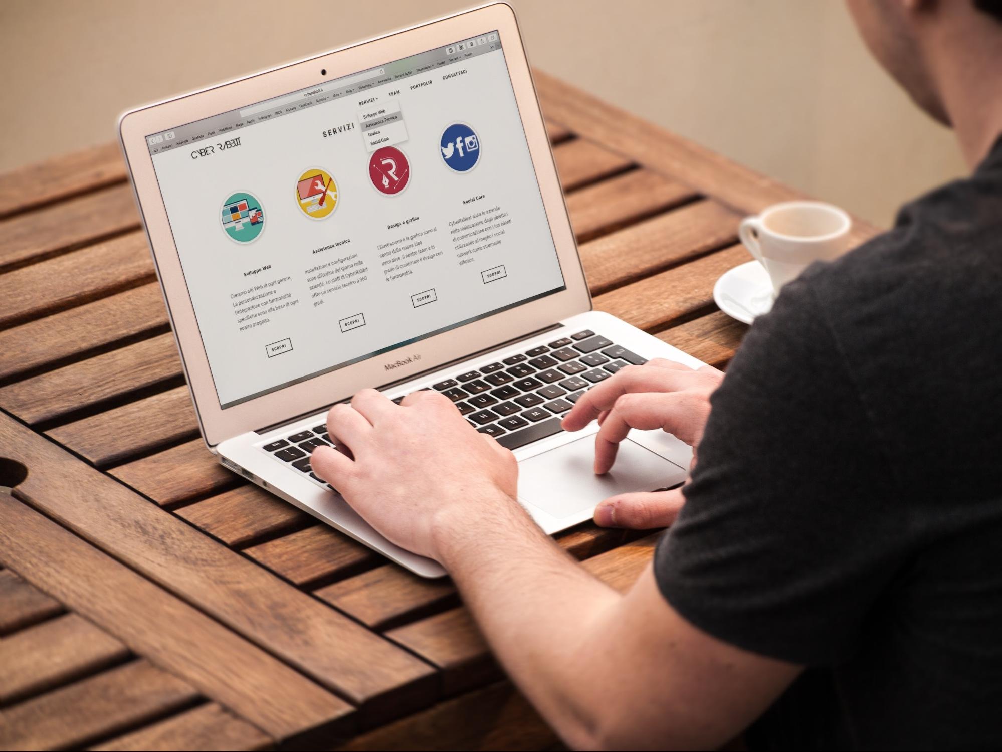
What “Above-the-Fold UX” Actually Means (And Why It Matters)
“Above the fold” is simply the section of your website someone sees immediately when the page loads.
No scrolling. No clicking. No exploring.
Just that first 3–5 seconds where your visitor subconsciously decides:
- “This looks legit.”
- “This feels confusing.”
- “This isn’t for me.”
- Or… “Okay, I need to know more.”
That first screen determines whether someone stays or bounces.
And when it’s poorly structured, cluttered, vague, or generic, attention drops before the first scroll ever happens.
The 3 Reasons Visitors Leave Instantly
Most websites don’t lose traffic because of bad ads.
They lose it because of bad first impressions.
1. There’s No Clear Message
If someone lands on your site and can’t immediately answer:
- What do you do?
- Who do you help?
- Why should I care?
They’re gone.
Vague taglines. Clever-but-confusing headlines. Stock-photo energy.
It creates friction — and friction kills conversions.
Your hero section should make your value crystal clear in seconds.
2. The Layout Has No Visual Hierarchy
Design isn’t about making something “look cool.” It’s about guiding attention.
If everything on the page is screaming at the same volume — big fonts, bright colors, multiple buttons — the brain checks out.
Strong above-the-fold UX uses:
- Clear headline dominance
- Strategic subheadline support
- One primary call-to-action
- Clean spacing
- Intentional eye flow
That’s layout hierarchy in action.
When it’s missing? Attention loss happens fast.
3. It Feels Like the Déjà Vu Template Trap
You’ve seen it.
Generic template.
Stock images you’ve seen on five other sites.
Buzzwords that say nothing.
When a website feels recycled, trust drops instantly.
People may not consciously say, “This is a template,” but subconsciously? They feel it.
And when trust drops, conversions follow.
That’s exactly why we built our Seamless Navigation Blueprint — to eliminate confusion, reduce friction, and make your website feel intentionally built for your buyer, not downloaded for convenience.
Attention Is a Currency (And You’re Spending It Fast)
The average visitor gives you seconds to earn their focus.
If your first screen:
- Loads slowly
- Overwhelms visually
- Lacks clarity
- Doesn’t present a next step
You don’t just lose a click.
You lose momentum.
And momentum is what turns browsers into buyers.
This is where many business owners misunderstand performance. They think traffic is the problem. So they increase ad spend.
But if the website experience is broken at the top? You’re pouring traffic into a leaky bucket.
That’s why understanding how website structure and user flow shape buying behavior is critical. If you want to go deeper into the psychology behind it, we break it down in our guide on how site experience directly impacts purchasing behavior.
(That’s not theory. That’s conversion science.)
What High-Converting Above-the-Fold Design Actually Includes
Let’s simplify this.
Your first screen should do four things:
1. Instantly Clarify What You Do
No guessing. No decoding required.
2. Speak to a Specific Problem
Make your visitor feel seen. If they feel understood, they stay.
3. Establish Trust Quickly
Subtle credibility markers matter:
- Social proof
- Clear positioning
- Professional design
- Clean typography
4. Present One Clear Next Step
Not five.
Not three.
One primary action.
When navigation is intuitive, visitors stay longer. And the longer they stay, the higher the likelihood of conversion.
The Hidden Cost of Ignoring First Impression Design
Here’s the real danger:
You won’t always know it’s happening.
Your analytics might show:
- “Traffic looks decent.”
- “Ads are getting clicks.”
- “SEO impressions are climbing.”
But conversions? Flat.
And it’s not because your business isn’t good.
It’s because your layout isn’t guiding.
A strong first impression doesn’t just look better. It reduces decision fatigue, builds psychological safety, and creates flow.
And flow creates sales.
How This Connects to Your Bigger Growth Strategy
Your website isn’t just a brochure.
It’s your 24/7 transaction hub.
Whether you’re running paid traffic, ranking organically, or sending people from social, every marketing effort eventually lands here.
Which means your website experience directly influences buying decisions more than you might think.
When your first screen is optimized:
- Paid ads convert higher
- Organic traffic engages longer
- Bounce rate drops
- Trust builds faster
- Sales conversations start warmer
That’s why our Website Design services don’t start with colors or fonts.
They start with buyer psychology.
We focus on structure before style. Clarity before cleverness. Flow before flash.
Because when the foundation is right, everything else compounds.
Quick Self-Check: Is Your Above-the-Fold UX Costing You?
Ask yourself:
- Can someone understand what you do in 5 seconds?
- Is there one dominant headline?
- Is your call-to-action obvious?
- Does it feel custom — or templated?
- Does it load fast?
If you hesitated on more than one of those… there’s opportunity.
And that’s a good thing.
Because small improvements at the top of your page can create a massive impact across your entire funnel.
Final Thought: The Scroll Should Feel Earned
Scrolling is a commitment.
Before someone scrolls, you have to earn it.
You earn it with clarity.
You earn it with structure.
You earn it with trust.
Above-the-fold UX isn’t just a design detail.
It’s the moment your visitor decides whether your business feels credible, capable, and worth their time.
Get that right — and everything downstream performs better.
Ignore it — and you’ll keep wondering why traffic isn’t turning into revenue.
And if you’re ready to stop losing visitors before the first scroll, start with your foundation. The difference between a website that looks decent and one that actually converts? Strategy.
And strategy always starts at the top. Contact Us.